Data Viewer Quick Start Guide
Updated for v2.6, June. 2025
Table of Contents: Data Viewer Overview Working with the Graph UI Step-by-Step Example of Benchmarking for Your Institution
Data Viewer Overview
These tools complement the CaRCC Capabilities Model with interactive data visualizations to explore the community dataset provided by institutions that are using and/or have completed assessments using the Model. The Model was developed to identify the variety of relevant approaches taken to support Research Computing and Data (RCD) and the key factors for providing that support. The Model is designed for use as an input to strategic decision making and is intended to be inclusive across a broad range of institutions.
The Data Viewer includes three types of views of the community dataset:
- Community Demographics provides graphical displays of information about the institutions in the dataset, from map views to charts to a scatter graph summary of the data. A set of view controls and filters allow users to focus the visualizations on a segment within the broader community. There is also a list of the contributing institutions by name.
- Capabilities Data and Benchmarking provides graphical displays of Capabilities Model Assessment Data in the community dataset, and the ability to benchmark assessment results relative to others in the community dataset.
- Priorities Data (coming in a future release) will provide information about the areas of capabilities that institutions marked as a priority for attention when they completed their assessment.
Working with the Graph UI
The Data Viewer page layout includes a display area with a graphing widget, and a sidebar that provides filtering and view controls.
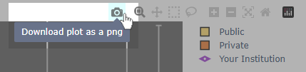
- The graphing widget in the main display area has built in controls to download an graph as an image file (e.g., to include in a report document), zoom and pan controls, etc. These controls show in the upper left when you hover over the graph area.
- Within the graph area, when a graph has a legend you can click on legend elements to hide aspects of the data.
The Filter panel on the left side provides a set of tools to change the type of data viewed, to filter the data according to a range of criteria, and some other view controls.
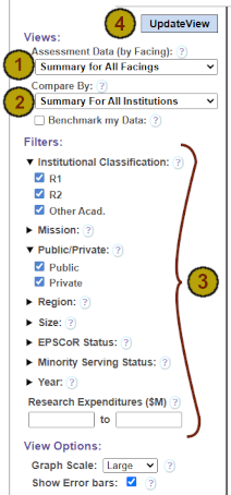
- When viewing Capabilities Data, there is a dropdown to choose data at a summary level across facings,
or to focus on topics within a chosen facing.
If you are a contributor*, you will also see a select to view individual capabilities data within Topics. - Many graphs allow you to choose views that compare subcommunities, e.g., by the Institutional Classification, by the Public/Private status, etc.
- A series of other filters allow you to filter on other institutional demographic metadata.
Filters can be combined to specify a particular subset of institutions to be graphed. - After selecting a set of desired views and/or filters, Click on UpdateView to see the results.
- (Not shown at left) Demographic visualizations include a filter to view all institutions using the caps model ("Users"), or just those that have completed assessments ("Contributors").
* To be a contributor you must be logged in and affiliated to an institution that completed an assessment within the last three calendar years: 2023 through 2026.
Step-by-Step Example of Benchmarking for Your Institution
In order to use the benchmarking tool, you must be logged in and affiliated to an institution that has completed an assessment using the Capabilities Model, submitted it, and had it approved by the CaRCC data stewards. See also the Capabilities Model Quick Start Guide and the Introduction and Guide to Use.
Once you’re ready to explore benchmarking, follow these steps:
Step 1) Log on to the portal (if you have not already). See also the Capabilities Model Quick Start Guide for details.
Step 2) Navigate to Capabilities Data and Benchmarking within the Data Viewer section of the portal.
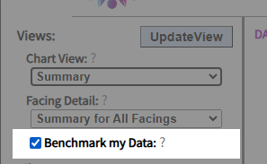
Step 3) Ensure the Benchmark my Data option is checked as shown in the image below:
Note: This will only be shown if you are logged in and your institution has at least one completed assessment.
Step 4) Select an area of interest. For example, suppose you want to see a benchmarking analysis of your institution's coverage of the individual capabilities related to Data Discovery and Collection, relative to institutions grouped by Institutional Classification:
Start by selecting the Data Facing: click the
Assessment Data (by Facing) select and choose Data-Facing Topics as shown in the image below:
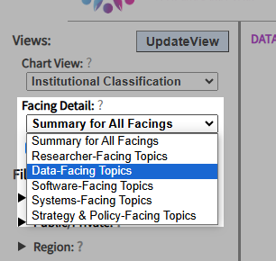
Click on Update View to see the results.
Next, drill down to the specific Topic: click the
Coverage Detail (by Topic) select and choose Data Discovery and Collection as shown in the image below:
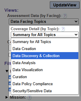
Click on Update View to see the results.
Finally, in the Compare By select, choose Institutional Classification as shown in the image below:
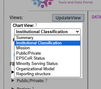
Click on Update View to see your institution’s capabilities coverage for Data Discovery and Collection compared to the broader community, grouped by classification.
To filter just those institutions that have between $150 million and $250 million
in research expenditures, enter 150 and 250 in the lower and upper range values for
Research Expenditures as shown in the image below:
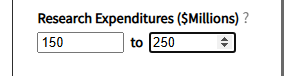
Click on Update View to see the results.
Step 5) Experiment with the other filters to narrow the set of institutions in your benchmarking group.
Note: If you have more than one assessment (e.g., if you did assessments in different years), the benchmarking view will include the three most recent assessments. For a simpler view you can hide any given assessment in the benchmarking view by clicking on the elements in the graph legend to the right of the graph.
Note also: the benchmarking views will filter the community data to only reflect those capabilities included in your most recent assessment. Thus, if your last assessment was an Essentials assessment or a Chart-Your-Own-Journey assessment, all capabilities data not included in that assessment will be filtered and so some Topics (or possibly whole Facings) may have no data to graph.